TextField
Text fields let users enter text into a UI.
- Make sure text fields look interactive
- Two types: filled and outlined
- The text field’s state (blank, with input, error, etc) should be visible at a glance
- Keep labels and error messages brief and easy to act on
- Text fields commonly appear in forms and dialogs
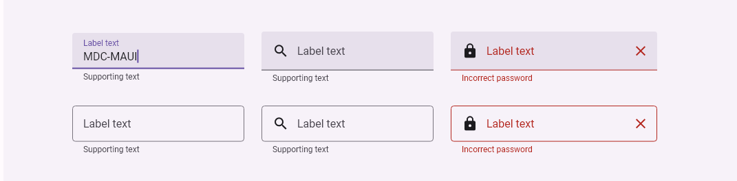
Examples
xml
<md:TextField
    IconData="{Static icon:Material.Search}"
    Style="{DynamicResource FilledTextFieldStyle}"
    WidthRequest="250" />

<md:TextField
    IconData="{Static icon:Material.Password}"
    Style="{DynamicResource OutlinedTextFieldStyle}"
    SupportingText="Incorrect password"
    TrailingIconData="{Static icon:Material.Close}"
    WidthRequest="300" />
Properties
| name | type | default |
|---|---|---|
| InputType | InputType | None |
| Text | string | empty |
| FontColor | Color | style |
| FontSize | float | 16 |
| FontFamily | string | |
| FontWeight | FontWeight | Regular |
| FontIsItalic | bool | false |
| CaretColor | Color | style |
| SelectionRange | TextRange | 0 |
| TextAlignment | TextAlignment | Start |
| IconData | string | |
| IconColor | Color | OnSurfaceVariantColor |
| TrailingIconData | string | |
| TrailingIconColor | Color | OnSurfaceVariantColor |
| ActiveIndicatorHeight | int | |
| ActiveIndicatorColor | Color | OnSurfaceVariantColor |
| LabelText | string | |
| LabelFontColor | Color | OnSurfaceVariantColor |
| SupportingText | string | |
| SupportingFontColor | Color | OnSurfaceVariantColor |
| BackgroundColor | Color | SurfaceContainerHighestColor |
| Shape | Shape | ExtraSmallTop |
| StateLayerColor | Color | OnSurfaceVariantColor |
Events
| name | type |
|---|---|
| TextChanged | EventHandler<TextChangedEventArgs> |
| TrailingIconClicked | EventHandler<EventArgs> |
| Clicked | EventHandler<TouchEventArgs> |
| Pressed | EventHandler<TouchEventArgs> |
| Released | EventHandler<TouchEventArgs> |
| LongPressed | EventHandler<TouchEventArgs> |
| RightClicked ( desktop only ) | EventHandler<TouchEventArgs> |