Card
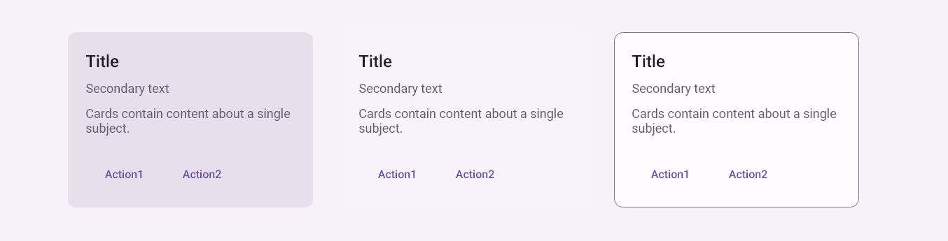
Cards contain content about a single subject.
- Use cards to contain related elements.
- Three styles: FilledCardStyle, ElevatedCardStyle, OutlinedCardStyle.
- Contents can include anything from images to headlines, supporting text, buttons, and lists.
- Can also contain other components.
- Cards have flexible layouts and dimensions based on their contents.
Examples
xml
<mdc:Card Style="{DynamicResource FilledCardStyle}">
    ...
</mdc:Card>
<mdc:Card Style="{DynamicResource ElevatedCardStyle}">
    ...
</mdc:Card>
<mdc:Card Style="{DynamicResource OutlinedCardStyle}">
    ...
</mdc:Card>
Properties
| name | type | defalut |
|---|---|---|
| Content | View | |
| BackgroundColor | Color | style |
| Shape | Shape | style |
| Elevation | int | style |
| OutlineColor | Color | style |
| Style | Style | Filled |