NavigationDrawer
Navigation drawers let people switch between UI views on larger devices.
- Can be open or closed by default.
- Two types: StandardNavigationDrawerStyle and ModalNavigationDrawerStyle.
- Put the most frequent destinations at the top and group related destinations together.
Examples
xml
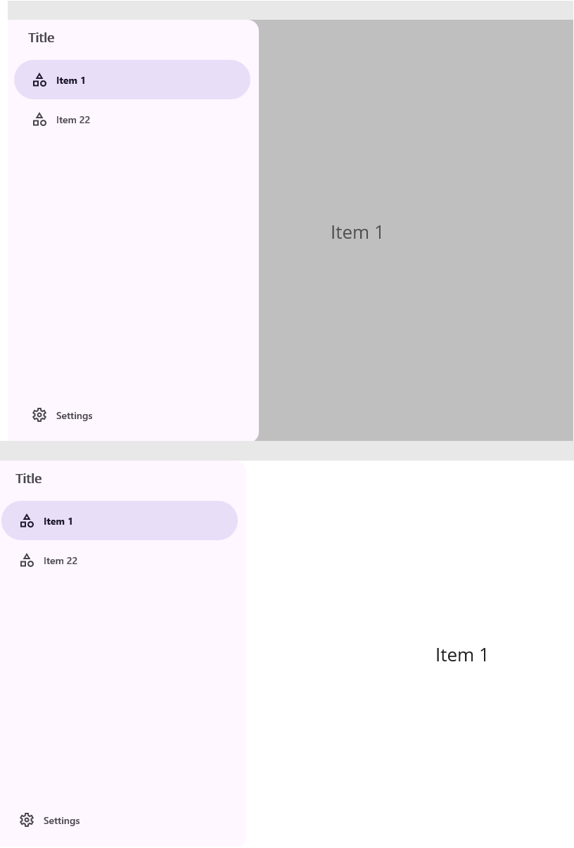
 <md:NavigationDrawer Style="{DynamicResource ModalNavigationDrawerStyle}">
     <Label
         Padding="20,0,20,20"
         FontAttributes="Bold"
         FontSize="18"
         Text="Title"
         TextColor="{DynamicResource OnSurfaceVariantColor}" />
     <md:NavigationDrawerItem IconData="{Static icon:Material.Category}" Text="Item 1">
         <Label
             FontSize="26"
             HorizontalOptions="Center"
             Text="Item 1"
             VerticalOptions="Center" />
     </md:NavigationDrawerItem>
     <md:NavigationDrawerItem IconData="{Static icon:Material.Category}" Text="Item 22">
         <Label
             FontSize="26"
             HorizontalOptions="Center"
             Text="Item 2"
             VerticalOptions="Center" />
     </md:NavigationDrawerItem>
     <md:NavigationDrawer.FooterItems>
         <md:NavigationDrawerItem IconData="{Static icon:Material.Settings}" Text="Settings">
             <Label
                 FontSize="26"
                 HorizontalOptions="Center"
                 Text="Settings"
                 VerticalOptions="Center" />
         </md:NavigationDrawerItem>
     </md:NavigationDrawer.FooterItems>
 </md:NavigationDrawer>

 ........................................................


  <md:NavigationDrawer Style="{DynamicResource StandardNavigationDrawerStyle}">
     <Label
         Padding="20,0,20,20"
         FontAttributes="Bold"
         FontSize="18"
         Text="Title"
         TextColor="{DynamicResource OnSurfaceVariantColor}" />
     <md:NavigationDrawerItem IconData="{Static icon:Material.Category}" Text="Item 1">
         <Label
             FontSize="26"
             HorizontalOptions="Center"
             Text="Item 1"
             VerticalOptions="Center" />
     </md:NavigationDrawerItem>
     <md:NavigationDrawerItem IconData="{Static icon:Material.Category}" Text="Item 22">
         <Label
             FontSize="26"
             HorizontalOptions="Center"
             Text="Item 2"
             VerticalOptions="Center" />
     </md:NavigationDrawerItem>
     <md:NavigationDrawer.FooterItems>
         <md:NavigationDrawerItem IconData="{Static icon:Material.Settings}" Text="Settings">
             <Label
                 FontSize="26"
                 HorizontalOptions="Center"
                 Text="Settings"
                 VerticalOptions="Center" />
         </md:NavigationDrawerItem>
     </md:NavigationDrawer.FooterItems>
 </md:NavigationDrawer>
Properties
| name | type | default |
|---|---|---|
| Items | ObservableCollection<View> | |
| FooterItems | ObservableCollection<View> | |
| SelectedItem | View | |
| Command | ICommand | |
| CommandParameter | object |
Events
| name | type |
|---|---|
| SelectedItemChanged | EventHandler<SelectedItemChangedArgs<NavigationDrawerItem>> |
NavigationDrawerItem Properties
| name | type | default |
|---|---|---|
| Content | View | |
| IsActived | bool | false |
| Text | string | empty |
| IconData | string | empty |
| IconColor | Color | OnSurfaceVariantColor |
| BackgroundColour | Color | Transparent |
| FontColor | Color | OnSurfaceVariantColor |
| FontSize | float | 14 |
| FontFamily | string | |
| FontWeight | FontWeight | Medium |
| FontIsItalic | bool | false |
| Shape | Shape | full |
| StateLayerColor | Color | OnSecondaryContainerColor |
| RippleDuration | float | 0.5 |
| RippleEasing | Easing | SinInOut |
NavigationDrawerItem Events
| name | type |
|---|---|
| Clicked | EventHandler<TouchEventArgs> |
| Pressed | EventHandler<TouchEventArgs> |
| Released | EventHandler<TouchEventArgs> |
| LongPressed | EventHandler<TouchEventArgs> |
| RightClicked ( desktop only ) | EventHandler<TouchEventArgs> |