IconButton
Icon buttons help people take minor actions with one tap.
- Icon buttons must use a system icon with a clear meaning
- Four types: FilledIconButtonStyle, FilledTonal ButtonStyle, OutlinedButtonStyle and StandardButtonStyle
- On hover, display a tooltip describing the button’s action (not the name of the icon)
- Use outline-style icons to indicate an unselected state, and filled-style icons for selected state
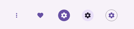
Examples
xml
<...
	xmlns:icon="clr-namespace:IconPacks.IconKind;assembly=IconPacks.Material"
...>

<mdc:IconButton IconData="{Static icon:Material.Star}" Style="{DynamicResource FilledIconButtonStyle}" />
<mdc:IconButton IconKind="{Static icon:Material.Star}" Style="{DynamicResource FilledTonalIconButtonStyle}" />
<mdc:IconButton IconKind="{Static icon:Material.Star}" Style="{DynamicResource OutlinedIconButtonStyle}" />
<mdc:IconButton IconKind="{Static icon:Material.Star}" Style="{DynamicResource StandardIconButtonStyle}" />
Properties
| name | type | defalut |
|---|---|---|
| IconData | string | empty |
| BackgroundColor | Color | style |
| Shape | Shape | style |
| Elevation | Elevation | style |
| OutlineWidth | int | style |
| OutlineColor | Color | style |
| StateLayerColor | Color | style |
| RippleDuration | float | 0.5 |
| RippleEasing | Easing | SinInOut |
| ContextMenu | ContextMenu | |
| Style | Style | Filled |
| Command | ICommand | |
| CommandParameter | object |
Events
| name | type |
|---|---|
| Clicked | EventHandler<TouchEventArgs> |
| Pressed | EventHandler<TouchEventArgs> |
| Released | EventHandler<TouchEventArgs> |
| LongPressed | EventHandler<TouchEventArgs> |
| RightClicked ( desktop only ) | EventHandler<TouchEventArgs> |